Tuesday, 1 May 2012
Monday, 30 April 2012
Evaluation Activity 4

How did you use new media technologies in the construction and research, planing and evaluation stages?
Throughout our project we used many different media technologies such as;
Blogger- Blogger is used to show the progression of our work, showing what we have done throughout our research and planning and keeping up to date with the theory side to our music video. I also used blogger last year but this year i was a lot more confident and was willing to try new things to try and create a better side to my theory. Blogger is an online way of writing everything down, a way to show everyone what you have to say about your work, how it was created and how my initial ideas came to life. It is also a way of keeping track on my work and filming schedules also helping me though my ancillary task, showing all ideas for our album cover and magazine advert.
Camera and tripod- This year we used exactly the same video technology as we did the year before, this year gave me a lot more confidence with using the video technology, i was able to create better angles and different shot types and distances. I was also able to show how i could capture raw and iconic footage that we wanted our audience to see, we wanted to hit their emotions, we want them to feel how tense and strong the video is. This is all done by the way we use the camera and editing, showing how we can use lighting to effect a certain scene.
You Tube- I used You Tube to find artists within my genre to help me find inspiration, i searched for videos that had created a video similar to my ideas, to help me though the planning and editing of my video. This is a great way of seeing what video where successful and which ones were not, helping me decide what ideas were good to use and showing me the ones not to use. Using such successful artists like, Taylor Swift and Kelly Clarkson, i had a brilliant range of videos and ideas that i could interpret into my own. Also i used a You Tube account to upload my animatic story board, this enabled me to upload my video to blogger using the URL given.
Final Cut Express- This is the programme used to create and edit our music video, Final Cut Express gives you the chance to use different software to add effects, transitions and use colour in a way to which it suits you best. This programme to begin with was very difficult to get used to, but after mounts of using it, it becomes a lot easier and you pick up a lot along the way.
Itunes- I used Itunes to import the song onto Final Cut Express for the music video, also like with YouTube i used Itunes to search for the an unsigned artist, searching through a lot of song and eventually deciding on Rachel Hawker 'Just A Taste'.
Timeglider- I used this to create a time line for my ' history of the music video's' this did take a while to grasp but when i did it gave me a good and fun way of showing the facts without it being boring, using different fonts, colours and also being able to have pictures.
The Mac- The mac computer enabled me to find the software such as Final Cut Express, Photoshop, Imovie and Iphoto, all of the software that helped me create and edit the music video and helped me though my research and planning stage.
Photoshop- This programme was were we created all of the pictures for our ancillary project. Photoshop was very interesting to use and quite difficult and temperamental, we did struggle quite a bit to get the right effects that we wanted but with persistence's we eventually got there, using lots of different colours and effects to fit with our music video genre.
Imovie- Imovie was used quite a lot during our research and planning stage, this is where we downloaded footage to put onto our blogs, for example our CD Digipack research and also our storyboard animatics.
Facebook- We used Facebook of a way of comunactaing with each other outside of the school hours, we also put our survey on there to get answerer's from our family and friends. We also posted many of our photos for our ancillary project here, so we could work on it from home. Facebook was the fastest way of communicating and getting work uploaded to work on.
SurveyMonkey.com- This is where
we created our survey to find out what our target audience wanted to
see in a music video. This helped us greatly because we found out
what they would like and what they wouldn't, this meant we were able
to create a video that our target audience would have wanted to
watch. we set many different questions to try and get a response that
would help our video be a greater success.
Microsoft Office Word- This was
where we were able to play around with texts for our ancillary
project, we were able to fine the font that fit best with our genre,
also finding the colours we wanted the texts to be in and the font
size is also important, so we were able to fine the right size for
us.
Powerpoint- This was a way of
presenting our initial ideas to our peers, to show them what we had
planed from the very beginning. This is a very effective way of
getting your point across and getting peoples attention, this was
used mainly in our research and planning section.
Paint- This was used to edit our images and was a quick and easy way of editing our 9 still frame images.
Safari and Mozillia Firefox-
These Two programmes they way we found out all of our information by
surfing the web on the Mac and a normal computer, this was really
helpful for our research and planning helping us find different
artist within our genre and researching into record labels.
Friday, 27 April 2012
Evaluation Activity 3
What have you learned from your audience feedback?
Positive audience feedback
http://www.wordle.net/show/wrdl/4576750/Untitled
Things we needed to work on
http://www.wordle.net/show/wrdl/4578773/Untitled
Positive audience feedback
http://www.wordle.net/show/wrdl/4576750/Untitled
Things we needed to work on
http://www.wordle.net/show/wrdl/4578773/Untitled
Sunday, 22 April 2012
Evaluation Activity 2
How effective is the combination of your main product and ancillary texts?
Inside Cover Left

Inside Cover Right CD

The inside cover right CD in this picture we decided that we would used the hands of one of the band members in the shape of a love heart, to fit with our genre and have the lead singer sitting in the leaves and have her face between the love heart. We have distorted this image though, the face is slightly blurry and the love heart is clear, we did this because we want to show that the symbol of love is powerful and greater than a persons image, what a lot of forget in reality. The colours are normal in this picture apart from the hands they are white to symbolise innocence. We have also got another quote 'Nothing hurts more than realising he meant everything to you, but you meant nothing to him', we chose this because we also think this fits really well with our genre and our general album theme of love. This quote is also in a purple colour because we want to keep with similar colours throughout.
Front Cover
 The Front cover, we decide to split four images to show different sides
to the band, one is of the lead singer and guitarist in sepia, with her
foot against a plain white wall and looking to the floor, showing shes
not too sure where he life is going and also shows that her music is
real. The next one is of the whole band sitting on the floor in the
leaves with the lead singer slightly in font of the other members of the
band, this is to show that the lyrics is an important part to this
bands perspective. This picture is in black and white just to mix up the
colour of the front cover, we thought it would be more effective and
eye catching. The next picture is a single picture of the singer in the
leaves, the colour of this picture is normal but we have made it
slightly brighter because this picture is slightly more flirtatious
than the others. You can tell this by the facially reaction and the way
she is sat. This is why we chose to have a four way slip to show
different emotions. The last picture is another shot of the bad together
this time the lead singer is in a tree, one other member is leaning on
the tree and the other is crouching on the floor in front of the tree.
We decided to so this to show different leaves and showing that we are
all different people, also we are all looking a different way. This
could be interpreted that we maybe don't share a strong bond together
but we become closer though our music. This picture is in a pale purple
colour to fit in with the colour of our text. The text on the front
cover is also in a pale purple and a pale grey colour, also the text is
quite curly and appears that the band has doodled there thoughts for the
title, this has a huge contrast to the band name and the album title
its self.
The Front cover, we decide to split four images to show different sides
to the band, one is of the lead singer and guitarist in sepia, with her
foot against a plain white wall and looking to the floor, showing shes
not too sure where he life is going and also shows that her music is
real. The next one is of the whole band sitting on the floor in the
leaves with the lead singer slightly in font of the other members of the
band, this is to show that the lyrics is an important part to this
bands perspective. This picture is in black and white just to mix up the
colour of the front cover, we thought it would be more effective and
eye catching. The next picture is a single picture of the singer in the
leaves, the colour of this picture is normal but we have made it
slightly brighter because this picture is slightly more flirtatious
than the others. You can tell this by the facially reaction and the way
she is sat. This is why we chose to have a four way slip to show
different emotions. The last picture is another shot of the bad together
this time the lead singer is in a tree, one other member is leaning on
the tree and the other is crouching on the floor in front of the tree.
We decided to so this to show different leaves and showing that we are
all different people, also we are all looking a different way. This
could be interpreted that we maybe don't share a strong bond together
but we become closer though our music. This picture is in a pale purple
colour to fit in with the colour of our text. The text on the front
cover is also in a pale purple and a pale grey colour, also the text is
quite curly and appears that the band has doodled there thoughts for the
title, this has a huge contrast to the band name and the album title
its self.
Back Cover

The
back cover this show an image of the lead singer in a red dress leaning
on a white wall with her guitar next to her, also her hair slightly
flowing in the wind and the fact that she is wearing converse shoes to
take the indie side and the read dress to take the more formal side. We
also have a swirly design in the top right hand corner to give it that
special edge. We then have our eight songs that we have made up
according to the genre, we though that they fit well with the love/break
up theme to our album.Also keeping with the colour scheme, we have
stuck to purples, whites and blues, that we think fits with the indie
genre. The font is also a curly but we have a different font on the
'Dirty Little Secrets' on the back to the front just to give it a
different feel. This is properly our most iconic cover because it shows
you two sides to the singer, the girly side and the more indie/relaxed side as you can see from our Mise-en-scene.

Overall our ancillary products were successful in showing the audience what we have on offer, showing them that this band is a band that has many ideas and also makes sure that it fits with what their target audience wants and fits into their genre. I think we did well on capturing the beauty of the band 'Reminiscence' and showing that the album 'Dirty Little Secrets' would fit into the market quite nicely.
Our New Idea's For Our Ancillary Products
After looking over our work and analysing it all, we decided that these pictures did not imitate the artist to the full extent, so with our audience feedback we thought it would be a good idea to change all of our ancillary products, so it fit better with our genre.
The Front Cover

The front
cover of our digipack depicts a meaning of a journey, conveying to
the audience that the artist is about to travel down a road of an
adventure, picking though the hard times in her life and coming out
on top. Also the name our album 'The Odyssey' fits with our meaning
and thought, as this simply means the journey. As does the name of
the band 'Reminiscence', as we have taken that from the word
reminisce which means, indulge in a moment and recall your past. To
reflect and look back on what you have done in your life, we felt
this fit perfectly with the message we wanted to put across and make
this band really relateable and real to the audience, giving them
hope as they sing about events in their lives that the audience may
have felt themselves. We emphasis this by showing our artist on the
floor, this is portrayed as the start of her journey and gradually
getting up and turning away, she is moving into a bright point in her
life, and not looking back on her past. We decided to use a road to
show that life can be a difficult passage, but life always has a
silver lining and you cant give up on your dreams and ambitions as
there is always light at the end of the road, we wanted our audience
to see that our artist will eventually get there, also giving our
audience hope for their own life's, it makes it more relateable and
real. We used natural colours to display an image of innocence, hope
and love, as this is what we wanted our artist to represent. Someone
who the audience can relate to, if going though a bad time, or bad
relationship, they can turn to music for the answer, we wanted to be
their answer. By using trees with an autumn feel, shown by the
yellow/orange colour, we show that our genre is country, and that
nature plays a big part of this genre, as we have looked into others
in this genre, with Taylor Swift being our biggest influence and most
of her video present some form of nature, to again show innocence.
This also shows that the music will be calming and mellow. Another
indicator of this is the use of the guitar, this is a big part of the
artists life and also shows our genre again to be county. We can see
just how much her guitar means to her as she has continually got it
with her in all four shots of her on the road. This means she will
not get rid of her guitar and she maybe moving on in her life but her
guitar will be staying with her on her 'Odyssey'. The colours and
lighting are a key part to show the audience exactly what genre is,
also the artist is the main selling point as we wanted it to be all
about her, and her struggling life, and how she deals with it though
music, and show the audience that life is hard and it can knock you
down, but with a little bit of help and inspiration you can get back
up again. There is also a meaning to the way we have lined our
pictures, as we see her sat on the floor in the first one with very
casual/typical clothes for a country genre with light colours and
converses, and also a headband. We then see her kneeling in
darker/smarter clothes showing she is raising in her life and things
are on the move, also the guitar is held in the exact same way to
show she is still unsure and worried about the road and journey
ahead. The next image is the artist in a little black dress with a
cute white bow, showing her femininity coming into her life and she
is changing. The guitar has now moved and is standing next to her
with her holding it and almost looks as if it is holding her in
place. This is the key image for the beginning of her change. The
last image is of her turned away in a beautiful red dress, showing
her glamorous side, and still her guitar by her side, giving her a
sense of belong and showing her that if she moves on in her life she
wont really lose anything. This links with our genre also being
slightly pop, as the glamorous side comes out it will be a
country/pop genre. As this is the front cover this must be the one
image that stands out, as this is what the audience will see first
and will judge instantly. So we had to make sure we used bright and
bold colours . We decided to use black for our titles as it contrast
with the other natural colours. We decided that our font would be
have to be bold and stand out, and we wanted to keep the femininity
so we went for a curly font. We found out that this was the best way
to get to our target audience as our research told us this is what
they want to see.
Inside Left

Inside Right 'Behind The Cd'

The Back

For the back cover we decided to keep
our original picture with the artist against a plain white wall, the
shot in black and white and her red dress as the stand out colour. We
wanted to give a feeling of emptiness, but show there is a glimmer of
hope and colour in her life, this is why we chose red, as it is a
very in your face colour and contrast well. Again the guitar is in
show but this time it is next to her, in this shot it is not the most
dominant as she is now standing on her own and it is only next to
her, implying its her helping hand. The artist is wearing white
converse shoes, which fits with the typical outfit for country but
they challenge the red dress, showing the audience that the country
girl inside of her is still there but she is changing for the best
and moving on with her life. This makes it more relatable for our
audience, as they may be trying to shake something of their
shoulders, she is trying to move on in her life and forget the pain
she has felt throughout her life. The ways she is stood in this shot
is very important as she is leaning on the wall and her legs crossed
giving the feeling that she is now totally relaxed and happy where
she has ended up, as this is the back cover we wanted the audience to
see she has completed the most difficult part of her journey, from
now on she makes her own decision and she has chosen her own path. We
have made changes to the rest of the back, the design in the corner
is different, we have added more to it, giving it a bigger impact,
showing our creative side, we have added flowers to it to fit with
our genre once more and hit the innocent side again. It is also very
curly and flowy to show femininity and no regret, also shows risk and
if your willing to take it to get where you need to be. We have also
added leaves as bullet points instead of numbers, we felt that the
numbers didn't do it justice and we needed to continue our nature
feel and our genre, also its different and gives it a unique point.
The title of the album 'The Odyssey' is the same font as on the font
cover but in this shot we have flipped it on its side to go along
side her, conveying her 'journey' is always one step by her, no
matter what life throws at her. It is in a larger font to the song
names, they are not as curly and not as bold. This is because all of
the songs are about her life, it is a very personal album, that she
wanted to share, the songs all like to the sense of pain, heartache,
life changes and pure hope. That's why we used such names as' Sinner'
or 'Moments' to show the audience that this artist is completely
honest with herself and everyone who listens to her music, she did it
to help others though their 'Odyssey'. We have also put our record
label on the back 'Big Machine Records', to show it is real and
authenticity. We chose 'Big Machine Records' as our record label
because this is the label that signed Taylor Swift, who was our
biggest inspiration, and our biggest role model, so we went with hers
to fit our genre. We have also added a bar code again to show it is a
real CD and you can buy this in shops.
The Magazine Advert

The magazine advert, we felt that this
was a very important image to get right, as this is the first image
and insight to our album and what our artist is really about. We
tried to get a little bit of everything in the magazine advert
without crowding it to much. As our album is about a journey we went
for the open road shot, to show that life can be an open journey,
what makes it is the decision you make and how you act on them. We
decided to place the artist slightly of center as we wanted the name
of the album 'The Odyssey' to go along side her and go along the road
to convey the journey. We have the artist sat on an amp in her red
dress, her guitar but this shot is different as we have her in heals
to make her more appealing to the audience and to show the glamour
side to her is coming out and she is comfortable to move on, but not
completely as we still have the guitar. Her guitar goes everywhere
with her and shows that the country element is still there no matter
if she is changing within herself. The text font is still the same
for 'Reminiscence' and the 'The Odyssey', we have the band name
bigger as we are trying to promote them. Without telling the audience
the meaning behind the band in the magazine advert, 'Reminiscence'
comes from the word reminisce, and everyone knows this means
reflection. So it shows the band will be honest and song about really
meaning. Considering the album is quite depressing as she sing mainly
about pain, this shot shows hope, with the blue sky showing light at
the end of the road and the road being the thinking stage as this
road becomes easier with time and the artists 'Odyssey' will
gradually get better and to show her development in life. As the text
is the same in this shot as in the album this is to give the artist
more of a sense of brand identity. As our first magazine advert we
had the artist facing away from the camera hiding away from life, we
felt we need a new angle so we decided to show her face, and convey
that she is going to face this 'Odyssey' head on, to show to our
target audience, which is mainly teenage girls, that you cant hid
from your life, you have to be brave and face the road ahead. We also
have a comment from the award winning music magazine, NME, giving us
a five star ratting and saying ' There is a beauty here that depicts
how unique the band is', this fits with our unique feel that we have
to offer and shows that we are really and meaningful. We have also
added the release date for the album so people who buy the magazine
will see when we go on sale and also added our website, so if they
wanted to know more then they could log on and find out more about,
our life's and background, history and all of our general band ideas
and everything you need to know about us.
Overall, i believe the creating new ancillary products has been more
beneficial, as we have been able to pull apart the true and hidden
mean behind the band, the artist herself and the album. To show the
meaning of our brand identity and how important music really is to
this band. The artist sings about life and how she has had to deal
with it leading a helping hand to the audience and saying, she is
there for you, she has felt your pain but moved on with her 'Odyssey'
she is finally letting go of her past and moving on. In comparison to
our original digipack we have used a lot more digital technology, to
create a better feel for our album, using more advanced software such
as Photoshop, the green screen, and our own person persistence as all
of the pictures we took ourselves, we had to wait for the weather to
be correct and to the right mood for our shot, it took time but it
was worth the wait and the shear determination. As this is very
audience based we had a peer assessment to our new ancillary
products to see if we had improved and they all agreed that this is
more relevant to out target market, an did the band justice. We
edited a lot of our colours to make them brighter and full of life as
we felt the original ones were to dull and didn't really get the
message across that we wanted. We wanted our album to be full of
emotion and passion for life, we did this by showing how pain can
destroy you but you can always come out on top if you believe and are
strong enough, as we link this to our final music video 'Just A
Taste' showing true love can almost break you, and forgetting is one
of the hardest things in the world, you can never really forget but
you can move on, and in time the pain fades and is replaced with
other emotions. I think we have now done our country genre proud and
justice, showing it has a lot more meaning than people really think,
they need to look deep within to find the hidden meaning, the is
depicted in our album 'The Odyssey' and the true meaning of 'The
Reminiscence', and the deep meaning within themselves.
Monday, 16 April 2012
Evaluation Activity 1
In what ways does your media product use, develop or challenge forms and conventions of real media products ?

4. Relationship of lyrics to narrative/visual
Picture number four is a really key moment of the video, it is a shot of me singing with my guitar and also my silhouette beside me. This part of the video make you really feel the meaning of the lyrics a lot more and is also very personal to the girl as you begin to feel her pain to. Using lyrics such as " I'm a dick I'm addicted to you" just show the raw emotion of the lyrics. As you begin to see the separating of the lyric sequences and the narrative people could concentrate on the action in the story and still receive the common theme of the artist singing the words. This was also an edited shot for the silhouette and I'm singing in font of the green screen. Also this shot is in black and white showing that her emotions are low and shes struggling with the pain of not having her true love beside her every moment of every day. This was a mid shot to enable that you could see her and her guitar, to show that her instrument is a way of releasing her emotions.
5.Representation of artist/band with reference to record label's expectations
6. Genre of music and how it is defined
By fading two clips
together as an opacity change in picture number six, i have tried to
convey the genre to the audience. It shows one picture of the girls
true love and another of her with another guy, showing that I'm
trying to hit the audiences emotions. Also showing this video could
cause a lot of stress but is also one of the main feeling thought the
world. The moment you lose your one true love. This narrative genre
is a very successful way of telling a story through the lyrics and
the raw emotion of the performance. This shot is a slightly higher
angle and with the fade coming through you feel what she feels and
this is what i wanted, i want the audience to feel her pain and
relate to themselves.
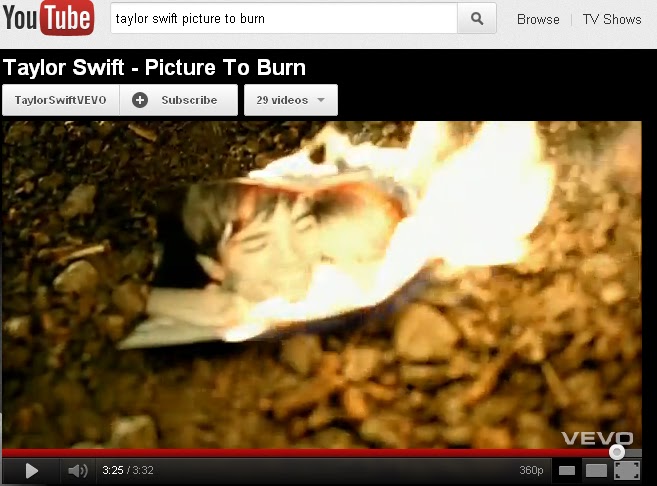
In Picture number eight you see a picture of the happy couple in flames, i took this idea from the music video Taylor Swift Pictures To Burn. I was able to show how she is trying her hardest to deal with the pain by burning the memory's but we all know its not as simple as burning a picture to remove it from your mind, this is the hardest thing in life to do, is to forget. This shot was created by also overlapping two images, as one was the picture and the i added the fire effect. I decided to do this as it is a very popular way of showing emotions.
 9. Setting/Location
Picture number nine is the many focus point for the setting of the love scene, this is the place where the love story started and also ended and she also brought the new guy to the same place to see if she could get over her one true love but this obviously didn't work as doing this made her want him more. Using the same location this then enhances the narrative of a break up and how she struggles to deal with it. The setting is the same as is the lighting and everything around them apart from the guy and this has a huge impact on how this scene makes you feel. No matter how hard the audience try s they wouldn't be be able to fight the raw emotion the the setting has on the whole music video and the story within its self. I have changed the colour of this picture and it is in sepia because i wanted to show that this was in in the past and is also behind her as she sing showing that this establishing shot will not leave her memory.

1. Relationship of music to visuals (e.g. editing sound with images)
Picture number one is the very beginning of the music video, it sets
the scene, this is a picture of a scrap book with happy memory's of a
relationship. This is a very important part to our song because it
shows how happy the couple were and you can hear with the lyrics
"Just A Taste" which is also what the song is called, that
this isn't going to end well. We had the idea of portraying the story
that this relationship was going to fall apart and she had "Just
A Taste" of him and didn't want to let go. The scrap book was
also what we based the rest of the video on. This was our first
initial idea and we built up from there. This clip has been sped up
and also changes colour thought the scrapbook, changing from normal
to black and white, to convey that the love is fading away. By
linking the lyrics to the narrative there is a bridge built to
enhance the transition from quick accustomed objects to the slow pain
of love, that you feel toward the end of the scrapbook scene and we
slow the pace down on what seem to be her favorite picture, showing
that she is reminiscing about the past.
2. Lighting
Picture number two creating a
juxtaposition, this is where the images are side by side. This
picture shows the a young girl sticking a picture on a mirror and
next to her in the mirror is herself with her guitar and singing.
This was an important scene to get the lighting right because working
with mirrors can be tricky so we had to find a natural light to make
that shot work. The two images overlap each other to give you a sense
that she is going back through her life, trying to live out the good
parts and trying to forget the bad. This scene was also good on
editing terms because we have used the green screen to overlap with a
normal image. The lighting is also very important when using the
green screen because if you don't get it right you will have shadows
and it will look terrible. The lighting was a very important part of
filming because i wanted to use the natural lighting as a contestant
part of each frame, giving that reflective theme.
3. Mise-en-scene ( costume, props,
make up, casting, expression)
This picture is of the couple messing
around with each other, creating a mood of happiness and it is a very
heartwarming scene. I think that this captures a brilliant expression
of love, by their movements and facial expression. the costumes also
fits this scene well, as we made the women wear t-shirts that fir the
mood here the t-shirt says " To be or not to be that is the
question" this is a famous quote from William Shakespeare, it
was just perfect for the love scene and also if you looked in to it
more it says that there could be a possibility that this love will
not last as she may not be the one for him. We did this with every
different scene where the mood changed, like the green screen when
she is sing with her guitar she is wearing a t-shirt with a guitar
for obvious reasons and when she is with the other guy she wears a
t-shirt that says "Behind the scenes" this could show that
there is more to it than meets the eye and there is a dark secret
within but in our case we show that she is trying to get over her one
true love. This picture appears to be a recording, showing that she
loves this memory so much that she wanted to record it and i uses a
long shot to show the scenery and all of there body actions. This is
one of the most romantic scenes throughout the video.
Picture number four is a really key moment of the video, it is a shot of me singing with my guitar and also my silhouette beside me. This part of the video make you really feel the meaning of the lyrics a lot more and is also very personal to the girl as you begin to feel her pain to. Using lyrics such as " I'm a dick I'm addicted to you" just show the raw emotion of the lyrics. As you begin to see the separating of the lyric sequences and the narrative people could concentrate on the action in the story and still receive the common theme of the artist singing the words. This was also an edited shot for the silhouette and I'm singing in font of the green screen. Also this shot is in black and white showing that her emotions are low and shes struggling with the pain of not having her true love beside her every moment of every day. This was a mid shot to enable that you could see her and her guitar, to show that her instrument is a way of releasing her emotions.
5.Representation of artist/band with reference to record label's expectations
Picture number 5 shows what the video is based about. It shows
the despair of her singing and how real life is now and not a dream
where everything comes true but her reality, behind her is pictures
of the past and how good it was when she was in love. We tried to
create a very symbolic message to our audience showing how real and
cruel life can be no matter how much it hurts. This is a very
relatable video because you can guarantee that everyone in the world
has felt this very moment within there life reminiscing on the good
times but not facing the times that are in hand. I looked into many
narrative videos and found that there was a center point of love in
each one, therefore i decided to try and create a raw emotions that
people can relate to.
6. Genre of music and how it is defined
7. Camerawork and editing (shot types, angles, movement; SFX and transitions)
Picture number 7 is two
images overlapping creating a imagination feel from the present to
the past. This shot had to be used to create the feel that time had
moved on but she didn't want it to relaying the image through her
mind and not being able to forget. I had to decrease the opacity on
one clip to get the overlapping image. This enabled me to show the
flashback in time. Both of the shots are between medium and a long
shots and also are both running scenes, therefore i could easily
overlap each picture. This was always going to be an important scene
that almost creates a divide between what you feel because you don't
know what emotion you feel as two different clips come together. This
was important to get into my video as you then really play with the
audiences mind. This Shot was one of our most powerful and most
effective shots throughout.
8. Intertextuality or influence of other music video
In Picture number eight you see a picture of the happy couple in flames, i took this idea from the music video Taylor Swift Pictures To Burn. I was able to show how she is trying her hardest to deal with the pain by burning the memory's but we all know its not as simple as burning a picture to remove it from your mind, this is the hardest thing in life to do, is to forget. This shot was created by also overlapping two images, as one was the picture and the i added the fire effect. I decided to do this as it is a very popular way of showing emotions.
Picture number nine is the many focus point for the setting of the love scene, this is the place where the love story started and also ended and she also brought the new guy to the same place to see if she could get over her one true love but this obviously didn't work as doing this made her want him more. Using the same location this then enhances the narrative of a break up and how she struggles to deal with it. The setting is the same as is the lighting and everything around them apart from the guy and this has a huge impact on how this scene makes you feel. No matter how hard the audience try s they wouldn't be be able to fight the raw emotion the the setting has on the whole music video and the story within its self. I have changed the colour of this picture and it is in sepia because i wanted to show that this was in in the past and is also behind her as she sing showing that this establishing shot will not leave her memory.
Thursday, 5 April 2012
History of Music Videos
This is the link for the history of music videos on timeglider.
http://timeglider.com/app/viewer.php?uid=line_fb4cfcd5e4ad0a6ff162ede5cc915c7c


http://timeglider.com/app/viewer.php?uid=line_fb4cfcd5e4ad0a6ff162ede5cc915c7c


Thursday, 22 March 2012
Record company name/profile logo

The music industry, a record label is a
brand and a trademark associated with the marketing of music
recordings and music videos. There are many different record label's
all over the world for all types of genre within the music industry
for example;Polydor, Island, Sony, Def Jam, Big Machine Records,
Syco, Universal and Warner Brothers. We have decided to use the
record label company Big Machine Record because this is the company
that signed Taylor Swift and she is are inspiration and role model
throughout so we are going to stick by her and go for the same record
label company, also they specialize in our chosen genre of county
music so it would be prefect.
 Big Machine Records is an
Independent American record label specializing in country music
artists. It was launched in 2005 by former DreamWorks Records
executive Scott Borchetta. The label was part of a joint venture
between Borchetta and country singer Toby Keith, although Keith
dropped his affiliation in 2006.
Big Machine Records is an
Independent American record label specializing in country music
artists. It was launched in 2005 by former DreamWorks Records
executive Scott Borchetta. The label was part of a joint venture
between Borchetta and country singer Toby Keith, although Keith
dropped his affiliation in 2006. Big Machine is based in Nashville,
Tennessee, and is distributed by Universal Music Group. The label has
one Grammy for Album of the Year, awarded to Fearless from
Taylor Swift. In November
2007, Big Machine Records founded a subsidiary imprint called Valory
Music Group. Acts signed to this roster include Jimmy Wayne (who was
formerly signed to Big Machine), Jewel, and Justin Moore. By late
2008, the label began promoting Canadian acts Adam Gregory and
Emerson Drive, who are also signed to Midas Records. Big Machine
ended promotion for the two artists in 2009. Reba McEntire joined
Valory in 2009, in association with her own label, Starstruck. Big Machine joined with Universal Republic in June 2009 to found a
new label, Republic Records Nashville.
Big Machine is based in Nashville,
Tennessee, and is distributed by Universal Music Group. The label has
one Grammy for Album of the Year, awarded to Fearless from
Taylor Swift. In November
2007, Big Machine Records founded a subsidiary imprint called Valory
Music Group. Acts signed to this roster include Jimmy Wayne (who was
formerly signed to Big Machine), Jewel, and Justin Moore. By late
2008, the label began promoting Canadian acts Adam Gregory and
Emerson Drive, who are also signed to Midas Records. Big Machine
ended promotion for the two artists in 2009. Reba McEntire joined
Valory in 2009, in association with her own label, Starstruck. Big Machine joined with Universal Republic in June 2009 to found a
new label, Republic Records Nashville.Saturday, 17 March 2012
Costume Planning


This will be the complete outfit worn
by the lead singer and female actress when singing on green screen only.
A printed white t-shirt with a guitar, brown boots and dark blue skinny
jeans. We decided to chose this because our music type is
indie/pop/country and this is a typical outfit that a female teenager
would wear and also goes with our video with the use of a guitar and
this is why we decided on the chosen t-shirt. Worn by Mercedes Sayles.


This will be the complete outfit
worn by the lead singer and female actress when singing when shooting
the beach and Newlands corner scenes. A printed white t-shirt that says
"To be or not to be that is the question" William Shakespeare inspired,
white converses and light blue skinny jeans. We decided on this outfit
because it fits the mood of a romantic love scene or break up. The
t-shirt shows both sides just like our music video. Also its just a
casual outfit and this is what we want, a normal everyday outfit with a
bit of an edge and we believe that the t-shirt will because of showing
both side to a love story just like William Shakespeare did. Worn by
Mercedes Sayles.


This could be the outfit worn by the
backing singer/guitar player and other female actress. Three possible
dresses very girly made of lase and very natural colours, with black
leggings and flat ballet pumps. We decided on possible using these as an
outfit because we want her to look girlie and more attractive than the
other female actress showing the audience that she has the edge and she
will win the love interest also so it shows her as innocent. Worn by
Chloe Alldis.


This could be the outfit worn by the
love interest. Smart shirt, branded t-shirt pale/dark jeans and
red/black and white vans. We decided on possible using these as an
outfit because we want him to look stylish and attractive as he is the
love interest and this is a very typical teenage male outfit, also its
casual/smart and this is the effect we want, we need him to look good
and appealing. Worn by Jamie Barnes.
Thursday, 15 March 2012
Location shots
We have a wide range of location shots for our music video our main location will be Newlands corner


 Our other location shots include a beach and a bedroom also the room we will be using to shoot on the green screen.


Subscribe to:
Comments (Atom)